

The Blog
Carly Kennedy Designs

5 Things Every Fitness Studio Website Needs (And Most Are Missing)
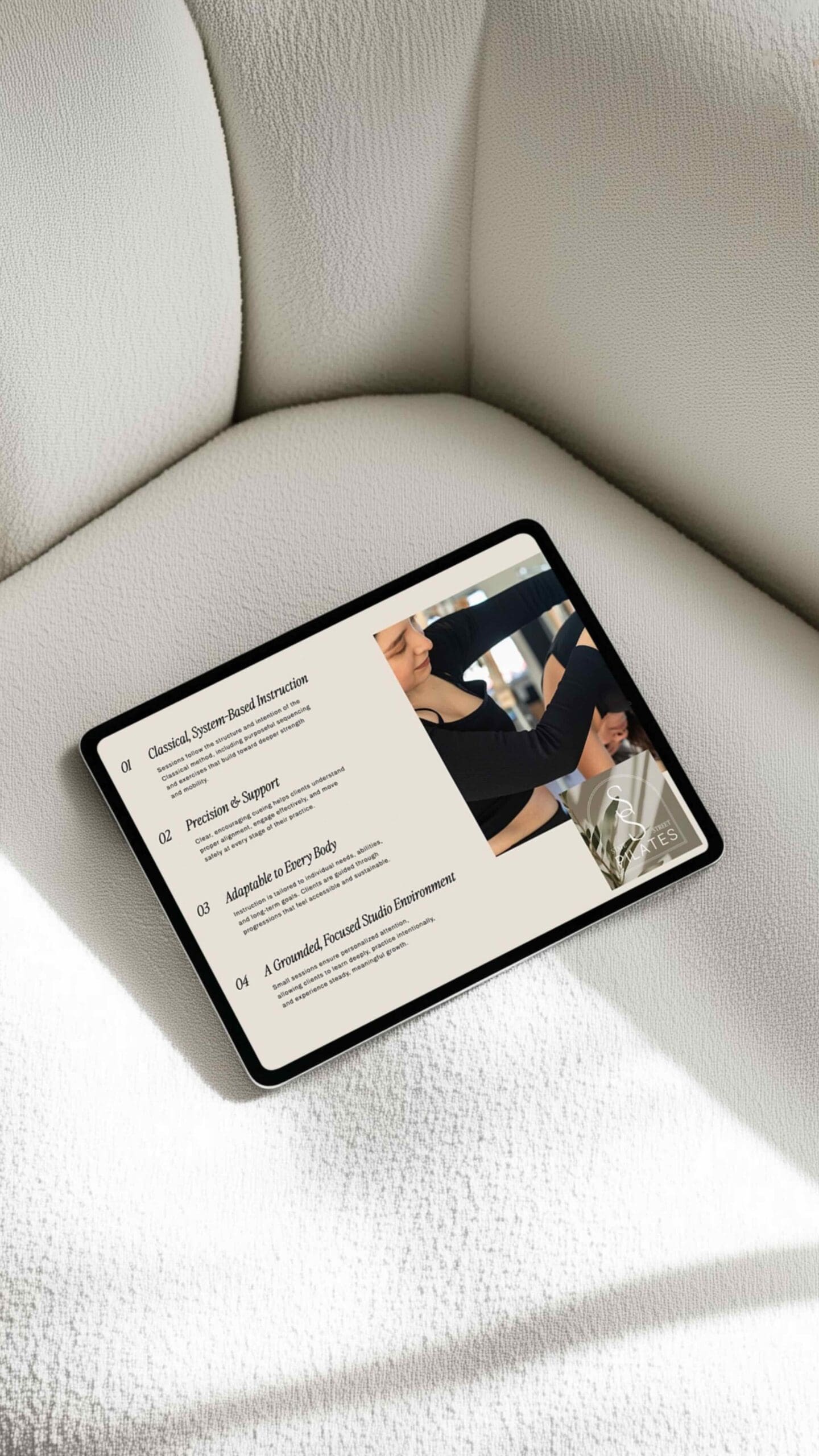
If your fitness studio has a beautiful Instagram but a website that’s an afterthought, you’re leaving money on the table. The truth is, most fitness studio websites — even well-established ones — are missing a few key elements that make the difference between someone closing the tab or actually booking a class.
I’ve designed websites for multiple Pilates studios, including State Street Pilates in Redlands, CA and The Studio in Cape Girardeau, MO and there are patterns I see every single time. Here’s what separates a fitness studio website that converts from one that just exists.
1. A Clear, Immediate Answer to “Who Is This For?”
When someone lands on your site, they’re immediately asking themselves: is this for me? Your homepage hero needs to answer that question within three seconds. That means a headline that speaks directly to your ideal client — not just your studio name and a generic tagline.
Think “boutique reformer Pilates for busy women in [city]” vs. “Welcome to [Studio Name].” One tells a story; the other makes visitors do the work.
2. Your Schedule and Booking — Front and Center
This sounds obvious, but you’d be surprised how many studio sites bury their schedule. If someone has to click three times to find out when your next class is, they’re gone. Your schedule (or a clear link to your booking platform) should live in your main navigation and on your homepage — not just in the footer.
For studios using Mindbody, Momence, or similar platforms, embedding your schedule directly into your website is a game-changer. It reduces friction and keeps people on your site longer.
3. Real Photos (Not Stock)
Stock photos of women doing Pilates on a generic reformer don’t build trust — they actually work against you. Your potential clients want to see your actual space, your actual instructors, and ideally real clients in action (with permission, of course).
Even a simple brand photoshoot — a few hours with a photographer — gives you content that carries your entire website. If I had to name one investment that makes the biggest visual difference in a studio website, it’s this.
4. A Page (or Section) That Explains Your Classes and Pricing
Pricing anxiety is real. If someone can’t find your rates without contacting you, many won’t bother. You don’t need to list every pricing tier on every page — but a dedicated classes or services page that clearly outlines what you offer and what it costs removes a major barrier to conversion. The classes & pricing page on The Studio’s site does a great job showcasing all of the options, benefits, and even FAQs.
Bonus: this also helps with SEO. Pages with specific, detailed content about your services rank better than vague overview pages.
5. Social Proof That’s Not Just a Generic Five-Star Rating
Testimonials work — but only when they’re specific. “Great studio, love it!” tells a visitor nothing. A testimonial that says “I had zero core strength after a C-section and six months in, I’m stronger than I’ve ever been” makes someone feel seen and hopeful.
Ask your clients for specific, results-oriented testimonials and place them strategically throughout your site — not just on a buried reviews page.
Your website should be your best salesperson — not your best-kept secret.
If you’re ready to have a site that actually reflects the quality of your work and brings in the right clients, I’d love to help. Whether you’re starting from scratch or finally committing to the rebrand you’ve been putting off, let’s build something worth sharing.


